MULTIMEDIA
Watching the Land Temperature Bell Curve Heat Up (1950-2020)
May 13, 2021
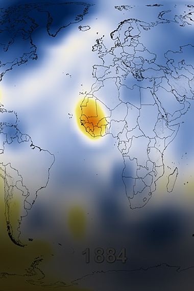
This visualization shows that as land temperatures have increased since 1950, hotter days have become more common and colder days have become less common.
When the bell curve becomes shorter, one can see more data trending toward the right, revealing hotter days.
Learn more and download the video here: https://svs.gsfc.nasa.gov/cgi-bin/details.cgi?aid=4891.


