MULTIMEDIA
Human and Natural Drivers of Climate Change (1850-2018)
July 1, 2021
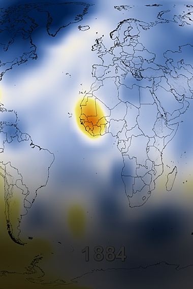
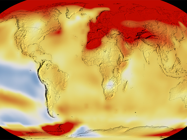
This animation shows how mid-stratospheric temperature, lower stratospheric temperature, surface temperature, ocean heat content (heat added to the ocean over time from global warming), and Arctic sea ice have changed between 1850 and 2018 from human and natural drivers of climate change. (More information on the layers of Earth's atmosphere can be found here: https://climate.nasa.gov/news/2919/earths-atmosphere-a-multi-layered-cake/.)
Each world map and plot comes from a different data source, with white lines representing modern observations. The green lines represent natural drivers, red lines show human drivers, and blue lines illustrate both natural and human drivers — all coming from climate model (simulation) outputs. As expected, the blue lines and white lines match because reliable modern observations (measurements of what actually happened) align with the total simulated data.
Clearly, human activities (primarily the burning of fossil fuels) dominate temperature increases at the surface (where humans live) and in the ocean.
Download the video and learn more: https://svs.gsfc.nasa.gov/cgi-bin/details.cgi?aid=4908.


.jpg?disposition=inline)




.jpg?disposition=inline)

