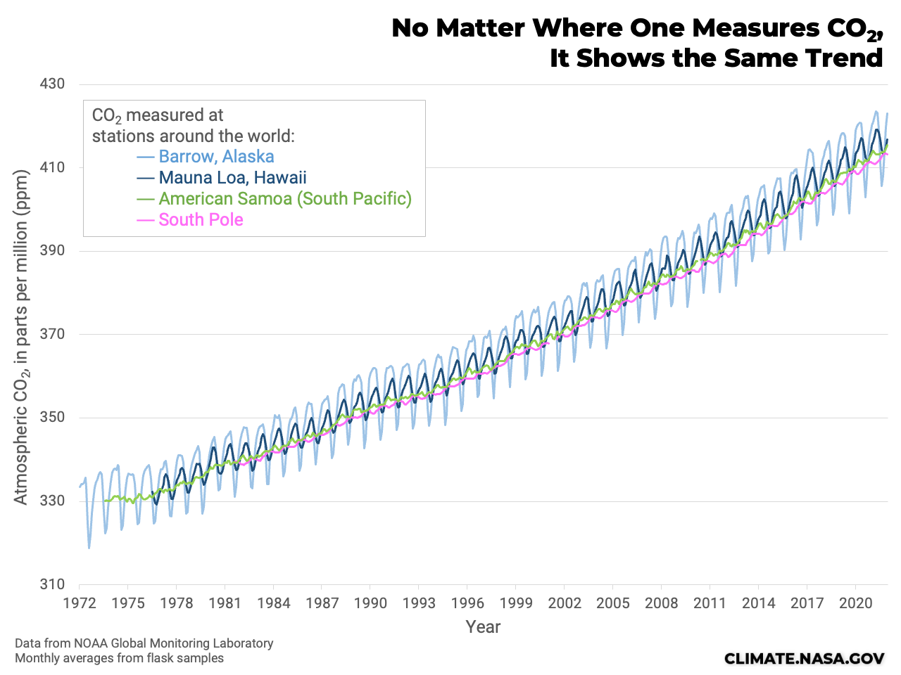
A line graph with four different lines. The vertical axis is labeled "Atmospheric CO2, in parts per million (ppm)" and the horizontal label is labeled with years from 1972 to 2020. The four lines show CO2 measured at different stations. A light blue line is for Barrow, Alaska, a navy blue line is for Mauna Loa, Hawaii, a green line is for American Samoa (South Pacific), and a pink line is for the South Pole. All the lines go up and down in a wave pattern over time, with a long-term trend of CO2 rising from around 330 ppm to above 410 ppm.
Long-term records from Alaska, Hawaii, Samoa, and the South Pole all capture the rising trend of CO2. The yearly “sawtooth” pattern is caused by plant growth. During the growing season, plants use CO2 for photosynthesis. Over the winter, plants decompose and return some CO2 to the atmosphere. This seasonal cycle is largest in the Northern Hemisphere, because it has more land area than the Southern Hemisphere. But regardless of the seasonal swings, the long-term increase of CO2 is similar around the globe. Credit: NASA

The amount of carbon dioxide (CO2) in the atmosphere is measured by many different methods, all around the world. By using more than one approach, scientists can be sure they’re measuring a global trend, rather than a local variation.

Full article in Ask NASA Climate.

READ MORE

Ask NASA Climate: How Do We Know Mauna Loa Carbon Dioxide Measurements Don’t Include Volcanic Gases?

NASA Earth Observatory: How do scientists know that Mauna Loa’s volcanic emissions don’t affect the carbon dioxide data collected there?

FAQ: What do volcanoes have to do with climate change?