News | October 26, 2014
Rising temperatures: A month versus a decade

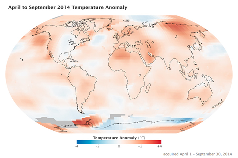
April to September 2014 temperature anomaly vizualization based on data from NASA's Goddard Institute for Space Studies. Credit: Kevin Ward/NASA's Earth Observatory
You may have heard that September 2014 was the warmest September ever recorded and that the past six months were the hottest April through September in 130 years of records. NASA Earth Observatory readers sometimes ask: How much does it matter when a monthly or yearly temperature record is broken? And where does global temperature data come from?
The NASA Goddard Institute for Space Studies (GISS) maintains the GISS Surface Temperature Analysis (GISTEMP), one of the most widely-cited global temperature records. To conduct this analysis, scientists at GISS use publicly available data from 6,300 meteorological stations around the world; from ship-based and satellite observations of sea surface temperatures; and from Antarctic research stations. These three data sets are analyzed to account for breaks in station records, urban heating artifacts, and the distribution of stations across the landscape. Then they are loaded into a computer program—available for public download from the GISS web site—that calculates trends in temperatures relative to the average temperature from 1951-1980. (Note: The GISTEMP analysis is limited to the period since 1880 because of poor spatial coverage of stations and decreasing data quality prior to that time.)
Since GISTEMP data is freely available on the web, scientists and journalists often download maps showing the most recent month as soon as the data becomes available. While an individual month, or even a few months, offers interesting insight into the weather, such a short time period can be a distraction from deeper discussions of climate change. Monthly and yearly temperatures are closely tied to weather, while climate scientists are more concerned with decade to century trends.
For instance, the map above depicts temperature anomalies, or changes from the norm, between April and September 2014; it does not show absolute temperatures. Reds and blues show how much warmer or cooler each area was during that period in 2014 compared to an averaged base period of the same months from 1951–1980.
“When you look at all the red in that map, there is no doubt that April through September was unusually warm in most of the world, but it’s the decadal trend that is more significant,” said Gavin Schmidt, GISS director. “Earth has experienced rapid warming in the last few decades, and the most recent decade was the warmest of all. What has happened so far in 2014 extends this ongoing trend. But in the context of climate change, it does not make sense to try to derive much meaning from a single month—or, for that matter, even a single year.”
How and when is NASA GISS data made available? Each month, after the most recent month’s data from the meteorological stations has been checked for errors and ingested by the analysis program, it becomes possible to generate graphs and maps that include the most recent month’s data on the GISTEMP website. In recent years, GISS scientists have released an analysis of the previous year in mid-January. For people looking for more details about the GISTEMP record, answers to several frequently asked questions are available on the GISS website.


